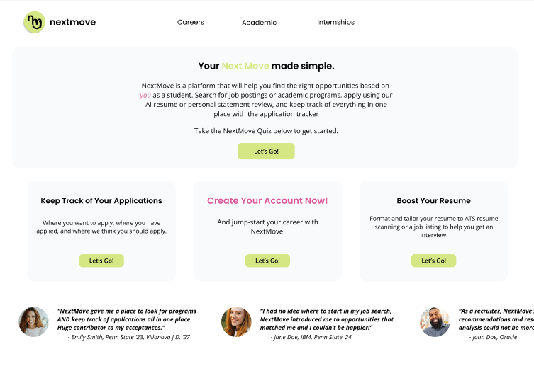
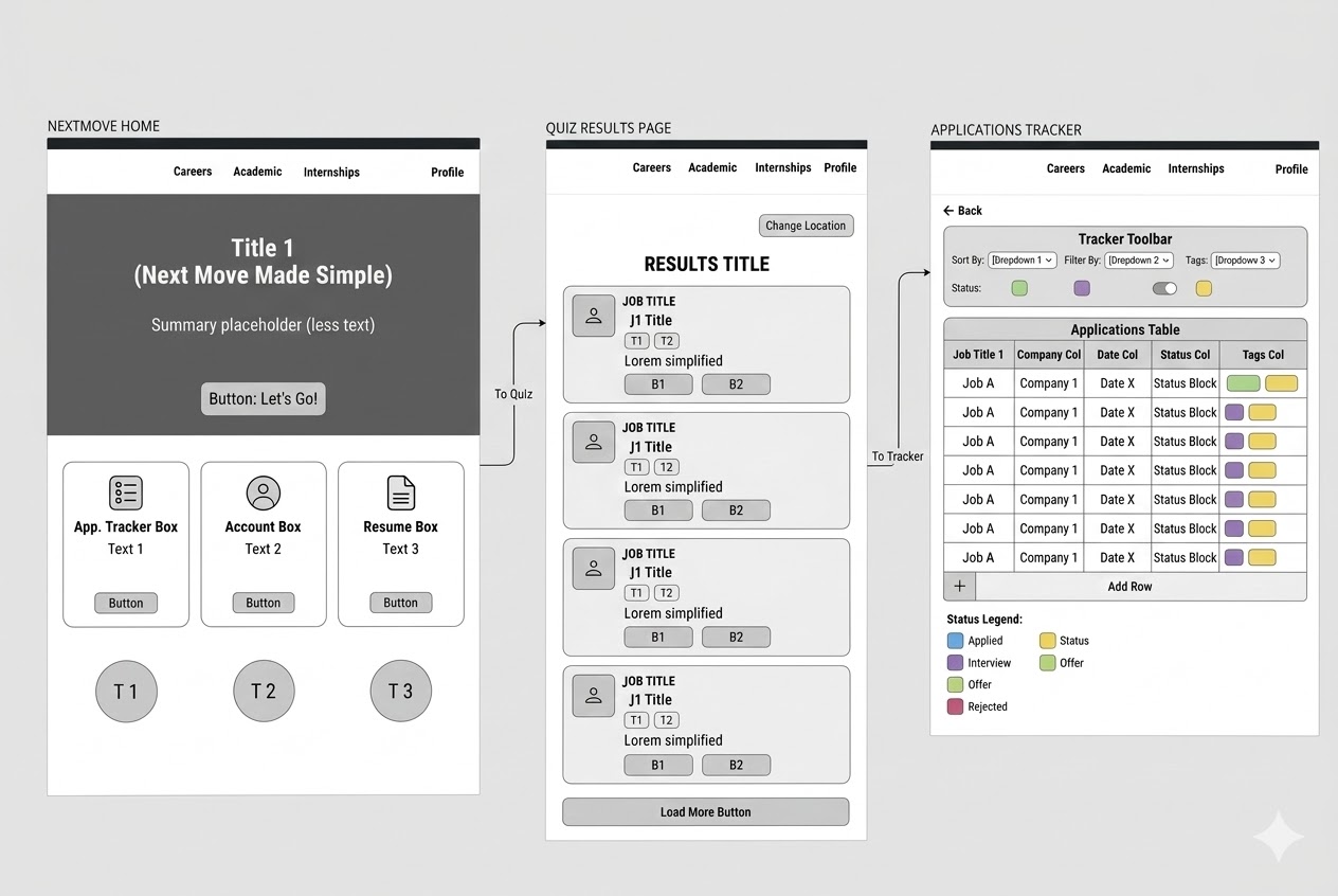
A student-focused web platform that consolidates post-graduation planning into a single, cohesive experience helping college students navigate job searches, internships, graduate school exploration, and application tracking with clarity and confidence.
Graduating college students face overwhelming confusion when planning their post-graduation paths. They juggle multiple tools such as LinkedIn, Handshake, spreadsheets for tracking, university portals. All of these together are leading to fragmented experiences, missed opportunities, and decision paralysis at a critical life transition.
I conducted comprehensive research to understand the graduating student experience, using surveys, interviews, and journey mapping to uncover pain points and opportunities.
Students use 5-7 different platforms to manage their post-grad planning, leading to lost information and duplicated effort.
"I have tabs open in three different browsers just to keep track of my applications. It's chaos."
Without clear structure or guidance, students feel paralyzed by the sheer number of options and pathways available.
"I don't even know where to start. Should I apply to jobs? Grad school? Both? I'm just overwhelmed."
Students struggle to see their progress, track deadlines, and understand what steps to take next in their planning journey.
"I wish I could just see everything in one place. what I've applied to, what's due, what I should focus on next."
How might we help graduating college students navigate post-graduation planning in a way that reduces confusion, consolidates fragmented workflows, and provides clear guidance for their next steps?
This problem is critical because students make life-changing decisions during this transition period, yet they lack structured support. The fragmentation across tools creates cognitive overload and leads to missed deadlines, incomplete applications, and decision paralysis. A unified platform could transform this chaotic experience into an organized, confidence-building journey.
Students reported using an average of 6.3 different tools to manage their post-grad planning, with 78% saying they've lost track of applications or deadlines because of this fragmentation.
When presented with unlimited options, 82% of students preferred a guided experience that helps them reflect on goals and narrows down relevant opportunities rather than browsing everything.
Students expressed high anxiety about not knowing if they're "on track." They wanted visual indicators of progress, upcoming deadlines, and recommended next steps to reduce uncertainty.
Without clear deadline awareness, students defaulted to reacting rather than planning. Seeing deadlines in context helped them prioritise tasks and reduce last-minute panic.
User journey map highlighting friction points in current post-graduation planning process
I ran a series of ideation sessions using Miro to explore different approaches to solving the fragmentation problem. Key questions included: Should we focus on aggregation (pulling data from existing tools) or creation (building new workflows)? How do we balance structure with flexibility? What features are must-haves vs. nice-to-haves for an MVP?
Ideation session exploring different feature sets and user flows
Why: Students needed help narrowing down options before exploring specific opportunities. A reflective quiz helps them identify goals and interests, reducing decision fatigue.
Trade-off: Considered AI-powered recommendations but chose a simpler rule-based approach for MVP to ensure accuracy and control.
Why: The #1 pain point was tracking applications across multiple platforms. A centralized tracker with status updates and deadline reminders addresses this directly.
Trade-off: Initially planned automatic data import from LinkedIn/Handshake but scoped down to manual entry for MVP due to API complexity.
Why: Students wanted to explore jobs, internships, and grad schools in one place rather than switching between platforms.
Trade-off: Built custom search and filtering instead of integrating third-party job boards to maintain consistent UX.
Why: Progress visibility was critical for reducing anxiety. A dashboard showing upcoming deadlines, application status, and recommended actions provides clarity.
Trade-off: Simplified the dashboard metrics for MVP—focused on actionable insights over comprehensive analytics.
I started with low-fidelity wireframes to test core flows and navigation patterns, then iterated based on feedback before moving to high-fidelity designs. The focus was on creating a clean, scannable interface that doesn't add to students' cognitive load.
Personalized home showing upcoming deadlines, application status overview, and recommended next actions based on user goals.
Unified search and filtering for jobs, internships, and graduate programs with saved searches and recommendations.
Application tracker with Kanban-style status columns (Saved, Applied, Interviewing, Offer, Rejected) and deadline management.
Guided questionnaire helping students reflect on interests, skills, and goals to surface relevant pathways.
Interactive Figma prototype of NextMove
I conducted moderated usability testing with 8 graduating students (mix of juniors and seniors) to validate core flows and identify friction points. Participants completed key tasks: taking the guided quiz, searching for opportunities, adding an application to the tracker, and checking their dashboard.
Unified experience: 100% of participants loved having everything in one place. "This is exactly what I needed" was the most common feedback.
Guided quiz: The quiz helped users who felt overwhelmed. 7/8 participants said it gave them clarity on where to focus.
Visual progress: The dashboard's deadline view and application status gave students confidence they weren't missing anything.
Quiz length: Initial version had 15 questions—users found it too long. Reduced to 8 focused questions in iteration.
Filter complexity: Discovery page had too many filter options. Simplified to 3 key filters (type, location, deadline) with advanced options hidden.
Mobile nav: Bottom navigation was hard to reach on larger phones. Moved to top navigation with hamburger menu.