VitaLog
A mobile app that helps people with celiac disease, IBS, and food sensitivities log what they eat and how they feel, then surfaces patterns to help them identify their triggers and take control of their health.


A mobile app that helps people with celiac disease, IBS, and food sensitivities log what they eat and how they feel, then surfaces patterns to help them identify their triggers and take control of their health.
Around 3 million Americans have celiac disease, and tens of millions more live with IBS, gluten sensitivity, or other food-triggered conditions. For these people, figuring out which foods cause symptoms is genuinely difficult. Reactions can be delayed by hours or even days, making cause and effect nearly impossible to trace without careful record-keeping. Most people rely on memory or scattered notes in their phone, if they track anything at all.
We started by asking: what does the current experience actually look like for someone managing a food-related condition day to day?
We used a mixed-methods approach: a screened survey distributed through celiac and IBS support communities on Reddit and Facebook, followed by one-on-one interviews with participants who opted in. We also conducted a competitive audit of existing food diary apps to identify gaps.
Participants were screened for a self-reported diagnosis of celiac disease, IBS, FODMAP sensitivity, or similar condition. Key findings from 52 responses:
From 9 semi-structured interviews (30–45 min each, conducted over Zoom), three core themes emerged:
Symptoms from celiac or IBS often appear 4–24 hours after eating. By then, users have forgotten exactly what they ate, especially ingredients in restaurant meals or packaged foods.
"I'll feel terrible on a Tuesday and have no idea if it's from lunch yesterday or dinner Sunday. By that point I can't remember what I had."
Existing apps are either built for calorie counting (wrong context entirely) or too clinical and complex. Users quit because it takes too long to log a meal or a symptom episode.
"I've tried three different apps. They all want me to search a food database and enter every gram. I just ate a sandwich — I don't have time for that."
Even when users did track consistently, they couldn't make sense of the data. Raw logs don't show patterns, and users need those patterns to have informed conversations with their gastroenterologist.
"I have months of notes but I still don't know what's causing it. No one's looked at it and told me anything useful, including me."
How might we help people with food-triggered conditions log meals and symptoms quickly enough that it becomes a habit, and then make sense of that data so they can actually identify their triggers?
The key tension we kept running into: the people who need food tracking the most are the same people most likely to give up on it. The logging experience has to be almost frictionless, or it won't survive contact with a real sick day. And the output has to be meaningful, not just a raw list.
Newly Diagnosed Celiac
IBS, Unconfirmed Triggers
Managing for a Family Member
A log entry should take under 30 seconds. We designed around quick-add meals with free text, not food database searches. Symptoms are logged with a single tap and optional severity slider.
The app's job isn't just to store information. It's to surface connections. The insight view shows which foods appear most frequently before symptom episodes.
This isn't a diet app. Users shouldn't feel guilt for what they ate. Language throughout is clinical but warm, supportive and not prescriptive.
A shareable summary report (PDF or printable) so conversations with a gastroenterologist or dietitian start with real data instead of vague recollections.
We ran two ideation sessions in Miro: a "Crazy 8s" round for quick divergent ideas, followed by an affinity mapping session to cluster and prioritize. The core debate was around how much structure to impose on the logging experience. Highly structured (dropdowns, categories, severity scales) versus freeform (just type what you ate or felt). Research strongly suggested freeform with light scaffolding won, as users hated being forced to search a food database.
We also debated whether the correlation and pattern engine should be manual (user annotates what they think is connected) or automatic (app surfaces possible links). We landed on automatic surfacing with user confirmation, keeping people in control of what they act on.
Why: The #1 reason users abandon tracking is that logging takes too long. We built a free-text meal entry with tag autocomplete for common items, with no food database required.
Trade-off: Loses nutritional data, but our users aren't counting calories. They're looking for patterns.
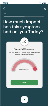
Why: Symptom episodes often hit when users feel least motivated to open an app. A widget-style check-in (type and severity) had to be the fastest possible interaction.
Trade-off: Considered a timed notification approach, but users resisted mandatory prompts. Opt-in reminders only.
Why: Raw logs are useless without interpretation. The dashboard shows flagged ingredients that frequently precede symptom days, over the past 7, 14, or 30 days.
Trade-off: Avoided claiming any medical diagnosis. All language frames findings as "worth discussing with your doctor," not as confirmed diagnoses.
Why: Users wanted to look back at a specific bad day and trace it forward and backward. A calendar with color-coded symptom severity lets them quickly locate and review any date.
Trade-off: Kept the calendar view simple. Avoided adding streaks or gamification that felt inappropriate for a health context.
We started with low-fidelity wireframes on paper and in Figma to nail the core flows: logging a meal, logging a symptom, and viewing the pattern insights. After two rounds of feedback, we moved to a high-fidelity prototype with a warm coral and deep teal color palette. We intentionally avoided the clinical white-and-blue look of most health apps. VitaLog should feel supportive, not sterile.
Condition setup and dietary restriction profiling, so the app knows from day one what to flag and what kind of language to use.
Fast free-text meal entry with ingredient tagging. Autocomplete suggests recently logged items to speed up repeat entries.
Tap to select symptom type (bloating, cramping, fatigue, etc.) with an optional severity rating and time-of-onset entry.
Color-coded calendar showing symptom-heavy days at a glance. Tap any date to review that day's full log and notes.
Auto-generated list of ingredients that appear most often in the 24 hours before reported symptoms, ranked by frequency.
A formatted PDF summary of the past 30 days, designed to be shared with a gastroenterologist or dietitian at an appointment.
Home screen showing today's log status, a streak indicator, and any recently surfaced pattern alerts for review.
Condition profile, reminder preferences, and dietary flags, all editable as the user's situation changes over time.


High-fidelity prototype — VitaLog
We conducted two rounds of moderated usability testing: an initial round with 6 participants on our mid-fidelity prototype, and a second round with 7 participants on the high-fidelity build. Participants were recruited from our survey pool and matched to our three personas. Sessions were run over Zoom with screen sharing, lasting 30–40 minutes each.
Each participant completed four core tasks:
Quick-log flow: 12/13 participants completed the meal log task in under 45 seconds without guidance. "This is so much faster than anything I've tried" was a recurring comment.
Calendar view: Universally praised. Users immediately understood the color coding and navigated back in time without prompting.
Pattern insights screen: 10/13 participants said this was the feature they'd come back for most. Several said they wished they had something like it right now.
Tone and design: Multiple participants mentioned the app didn't feel clinical or scary, which is important for people who are already anxious about their health.
Symptom entry discoverability: In round 1, 4/6 participants didn't notice the symptom log button. It was buried in a tab bar. We moved it to a prominent FAB on the home screen in the revised prototype.
Insights language: Several users were confused by the phrase "possible trigger." We revised to "appears frequently before symptom days" with a tooltip explaining the methodology.
Onboarding length: First version had 7 setup screens. Reduced to 4 by making condition profile editable later, not required up front.
Report export: Users loved the concept but wanted to preview the report before downloading. Added an in-app preview screen before the export action.
After completing the tasks, participants rated the prototype on four dimensions (1–5 scale, 13 respondents):
VitaLog reinforced something I think about a lot in health UX: the biggest barrier to behavior change is rarely motivation. It's friction. People with celiac disease want to track their food. They're sick. They have every reason to. What stops them is that the act of logging is annoying enough that on a bad day, they just don't. Designing around that reality, making the 30-second log the default and not the exception, was the core design challenge, and the testing results suggest we got reasonably close.
The pattern insights feature was the biggest learning. Users didn't just want a place to store data. They wanted something to help them make sense of it. That shift from "data repository" to "collaborative tool for understanding your body" changed how we thought about every screen in the app.
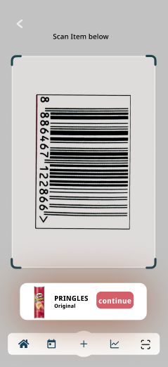
If we continued development, the next priorities would be: real-time ingredient lookup for packaged foods (barcode scanning), a companion web view for the doctor report, and more nuanced pattern detection that accounts for cumulative exposure, a known factor in celiac reactions that our current prototype doesn't address.